


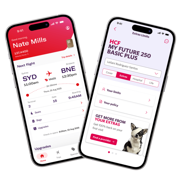
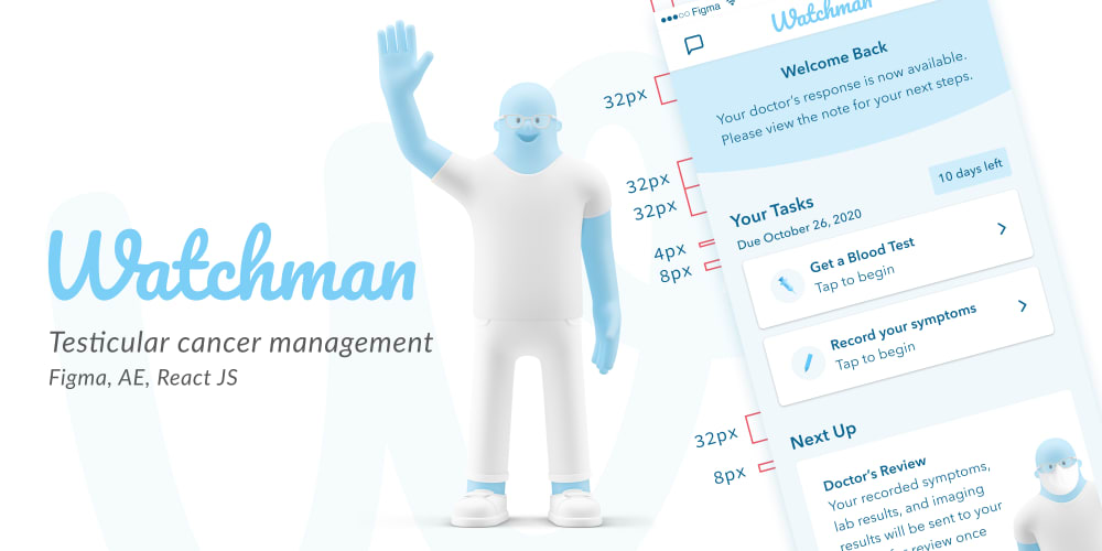
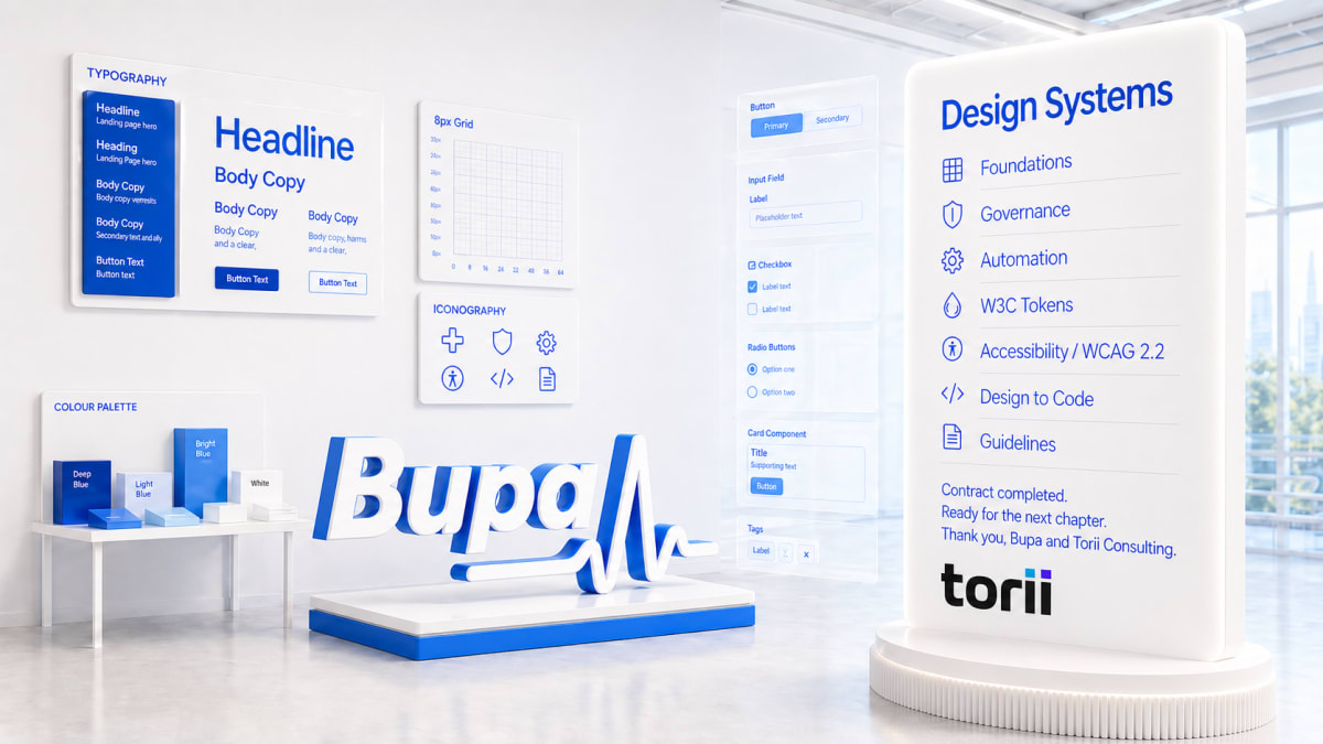
Design Systems Consultant
Bupa via Torii Consulting
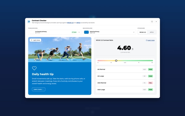
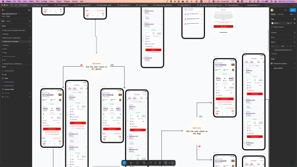
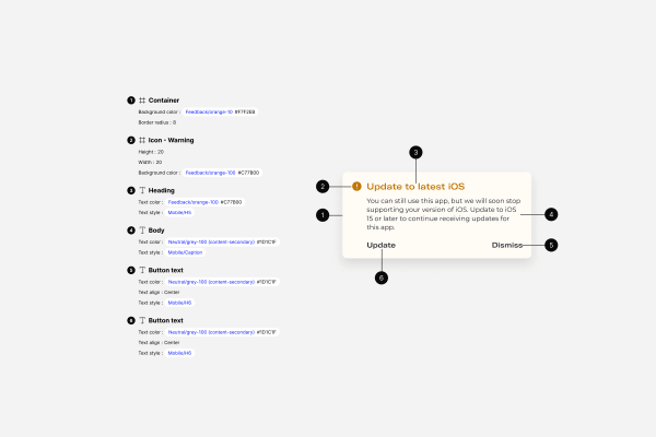
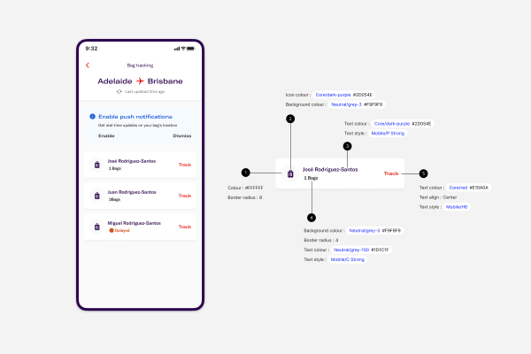
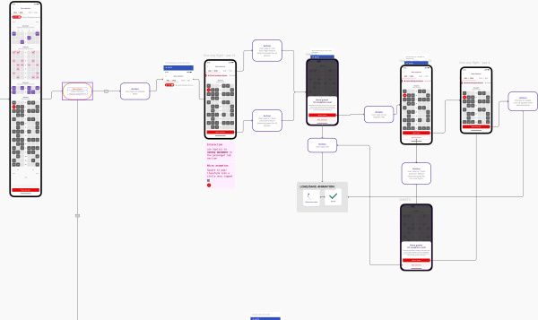
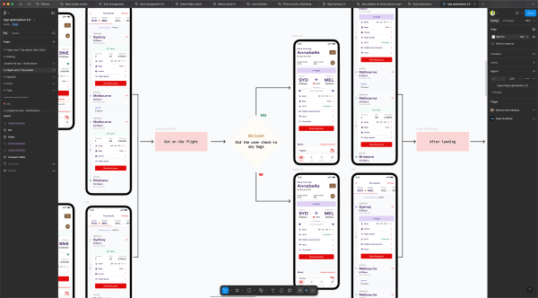
Contracted to audit the design system across Bupa, Blua, and Mindplace. Three brands, three platforms (web, iOS, Android).
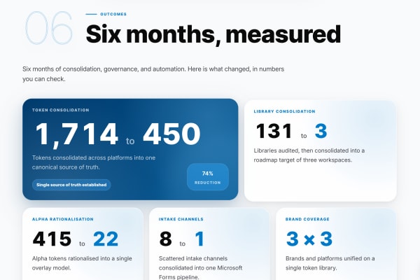
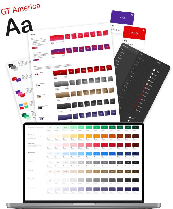
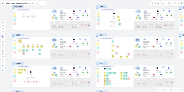
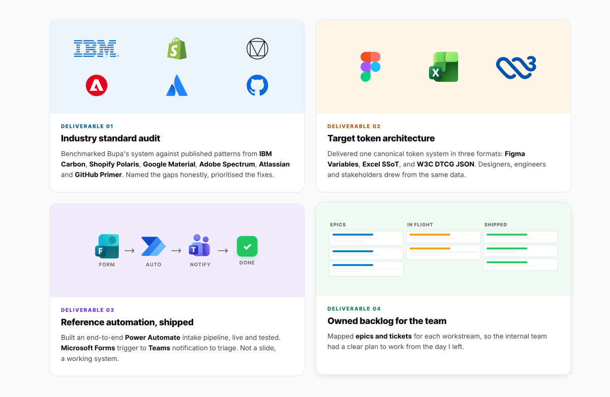
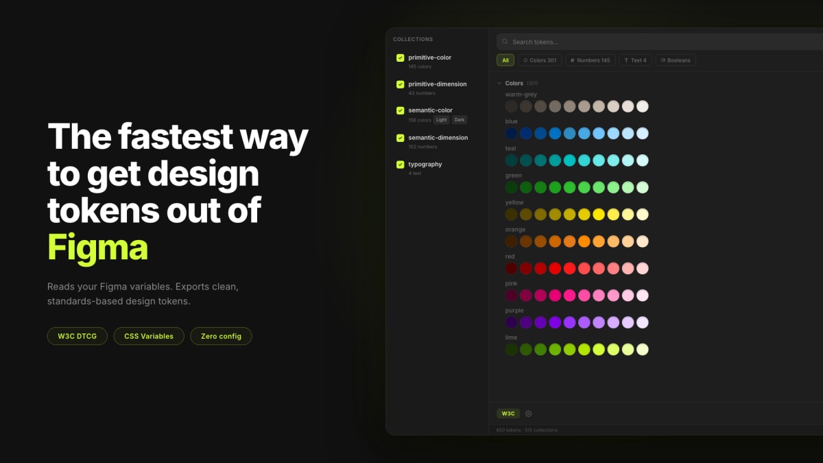
- Audited 131 Figma libraries spread across 8 workspaces (around 80 of them previously uncatalogued shadow libraries) and structured the roadmap to consolidate into 3 core Foundation, Platform, and Domain libraries.
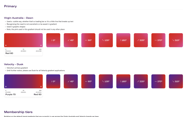
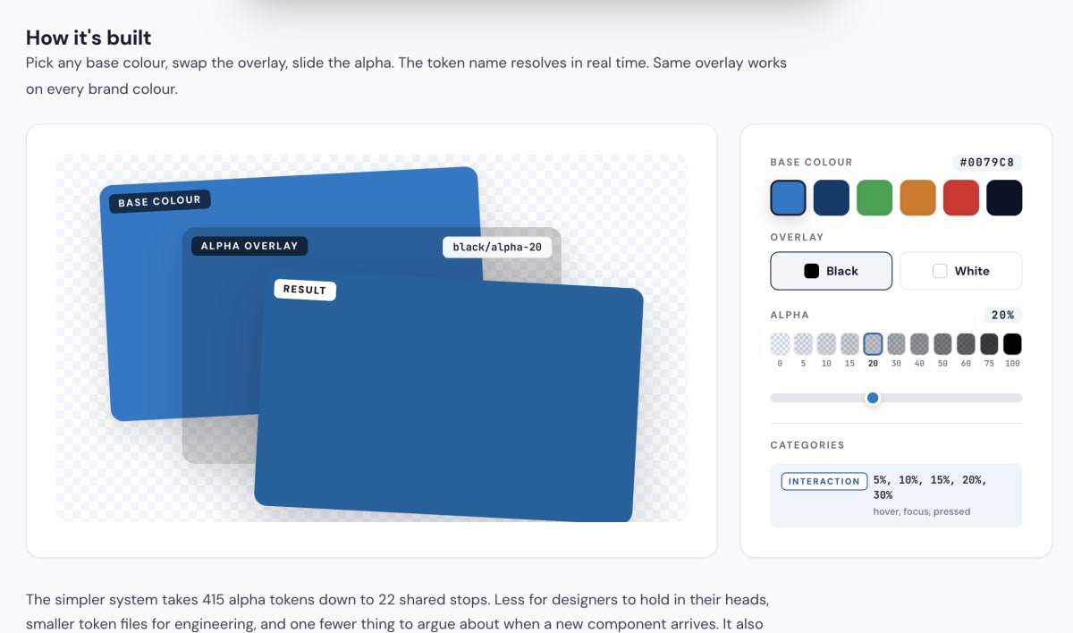
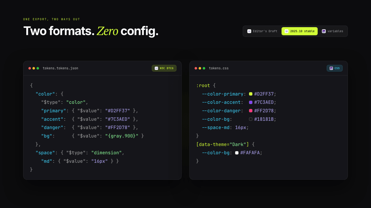
- Consolidated 1,714 design tokens down to 450 using W3C DTCG spec across a multi-brand token architecture.
- Delivered the full governance and automation roadmap, 45 plus work items across library, component, token, and tooling governance, structured into epics with implementation-ready stories for engineering.
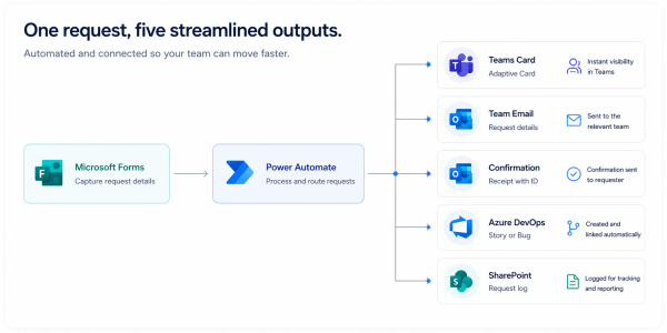
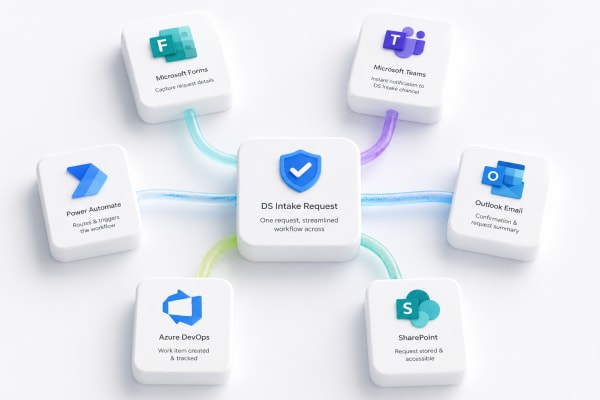
- Built out a full contribution intake pipeline end to end using Power Automate, Microsoft Forms, Azure DevOps, and Teams.


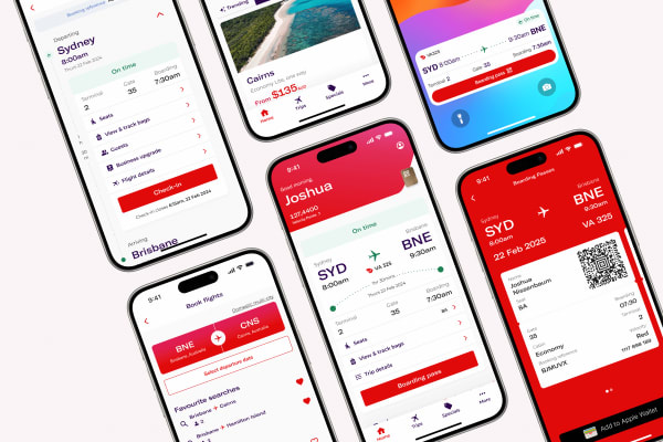
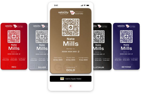
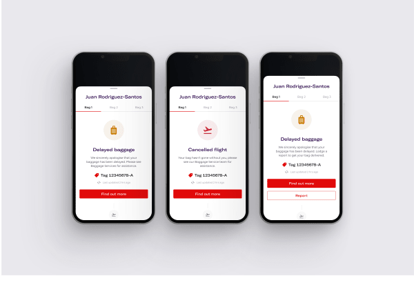
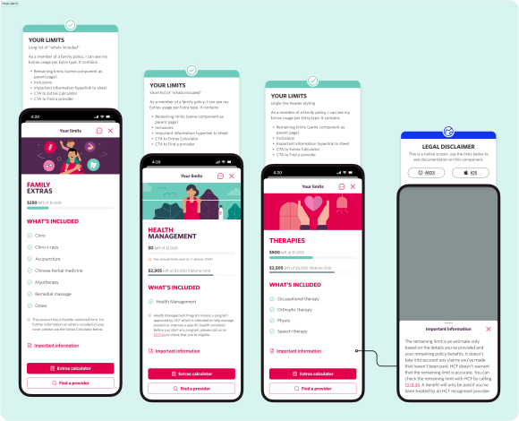
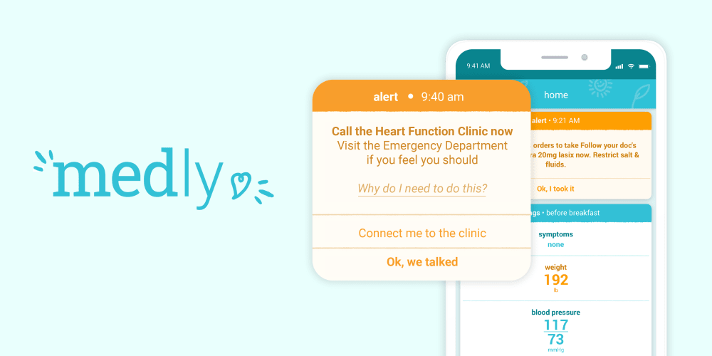
 Bupa case study


 Google Lighthouse


 View on npm